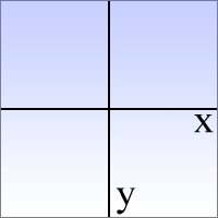
1. Cele trei axe carteziene utilizate în transformările CSS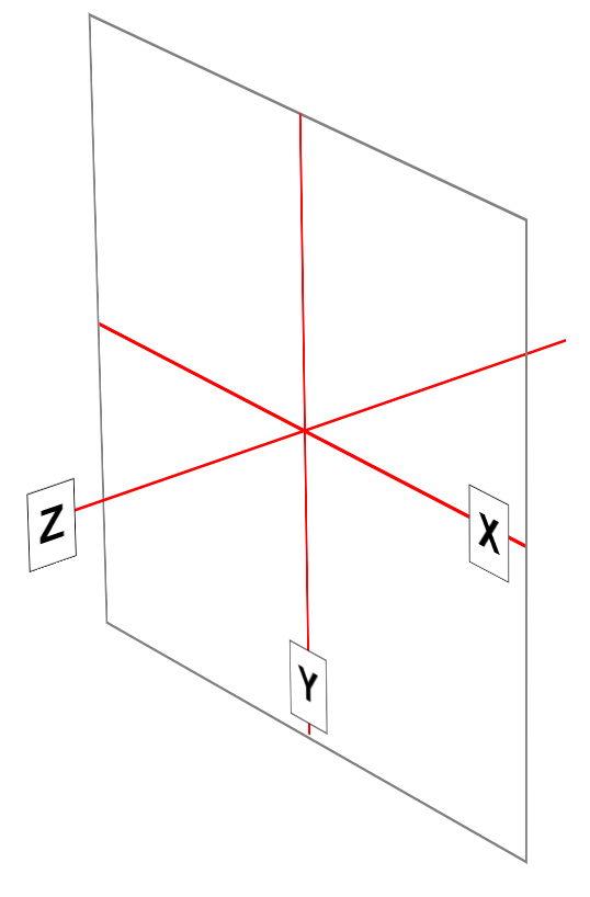
|
|
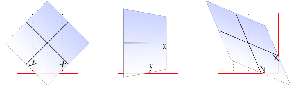
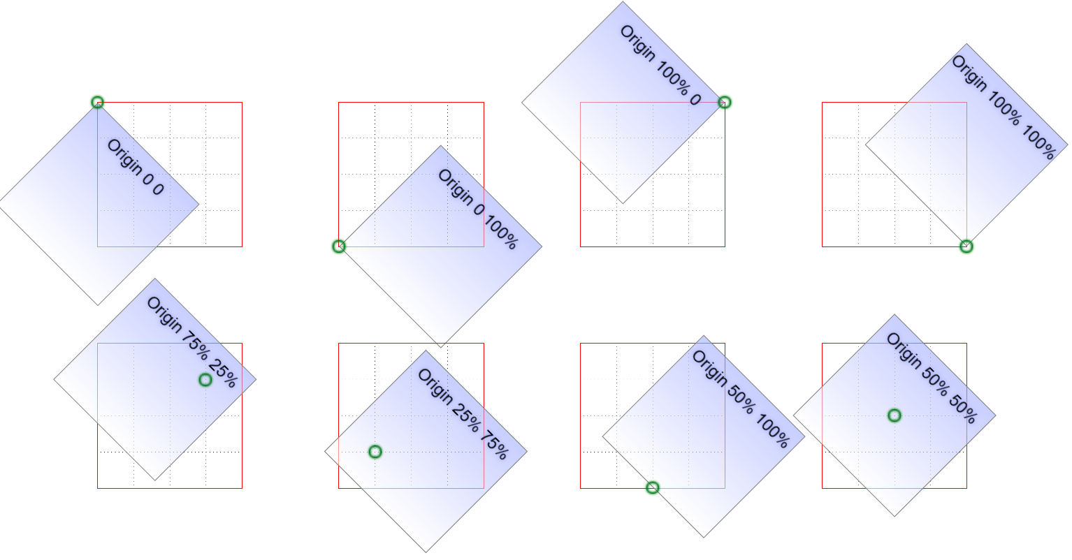
2. Sisteme elementare de referință
|
|
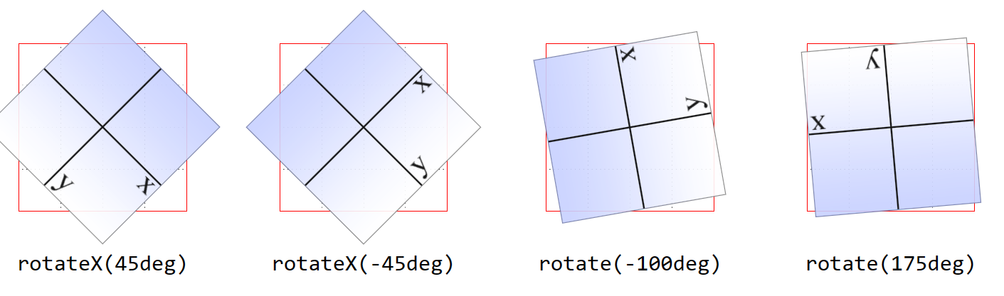
3. Rotații în planul xy
|
|
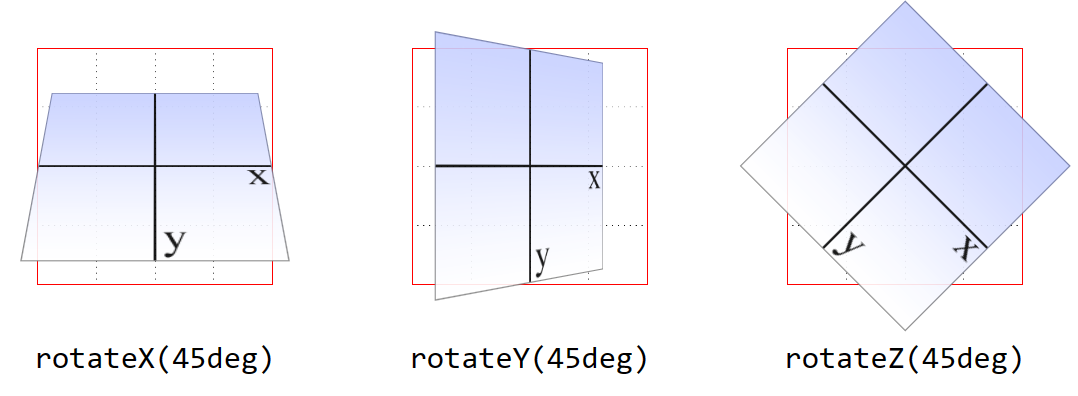
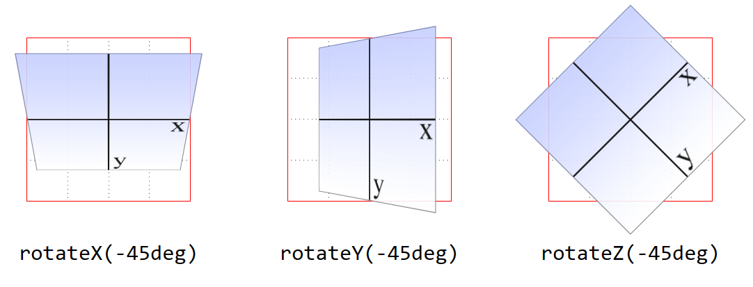
4.1. Rotații în jurul celor trei axe
|
|
4.2. Rotații în jurul celor trei axe
|
|
| Codul în HTML | Codul în CSS | Rezultat: |
< div id="example"> Eu am fost transformat < /div> |
< style type="text/css"> #tr1 { transform: rotate(30deg) skewX(-25deg) scaleY(2); border: 1px solid silver; float: left; } < /style> |
Eu am fost transformat
|
|---|
|
|
|
|
|
|
|
| Codul în HTML |
< figure> < div> < img src="box-axes.png" alt="" id="ex01"> < /div> < figcaption>rotate3d(0,0,1,45deg)< /figcaption> < /figure> < figure> < div> < img src="box-axes.png" alt="" id="ex02"> < /div> < figcaption>rotate3d(0,1,0,45deg)< /figcaption> < /figure> < figure> < div> < img src="box-axes.png" alt="" id="ex03"> < /div> < figcaption>rotate3d(1,0,0,45deg)< /figcaption> < /figure> |
|---|---|
| Codul in CSS |
< style type="text/css"> body {display: grid; grid-template-columns: repeat(3, 1fr); gap: 0 50px; max-width: min-content; padding: 50px 0;} div {border: 1px solid red; position: relative; background: url(frame-sq.png); background-size: 100% 100%; background-origin: border-box; transform-style: preserve-3d; perspective: 500px; transition: 5s;} img {height: 150px; width: 150px; vertical-align: bottom; opacity: 0.9;} figure {margin: 0; padding: 0; display: flex; flex-direction: column; align-items: center;} figcaption {margin-block: 20px 0; white-space: pre; font: 24px Consolas, monospace; position: relative; z-index: 5;} #ex01 {transform: rotate3d(0,0,1,45deg);} #ex02 {transform: rotate3d(0,1,0,45deg);} #ex03 {transform: rotate3d(1,0,0,45deg);} div:hover {transform: rotateY(360deg);} < /style> |
| Rezultat |
|
11. Diferența dintre rotirea în jurul a două axe și rotirea în jurul unei axe 3D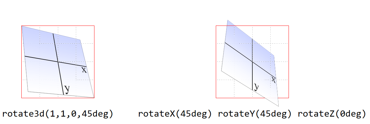
|
12. Înclinarea de-a lungul axelor x și y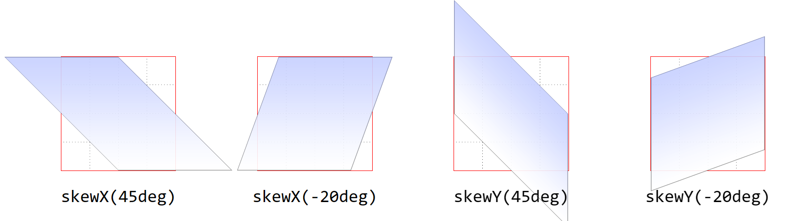
|
| Codul în HTML |
< section> < div> < img src="box.png" alt="" id="ex01"> < /div> < div> < img src="box.png" alt="" id="ex02"> < /div> < /section> |
|---|---|
| Codul in CSS |
< style type="text/css"> section {float: left; border: 1px dotted gray; margin: 2em 0;} div {border: 1px solid red; float: left; margin: 50px;} img {height: 150px; width: 150px; vertical-align: bottom; opacity: 0.9;} #ex01 {transform: rotate(33deg) translate(24px,25px) skewX(-10deg);} #ex02 {transform: matrix(0.838671, 0.544639, -0.692519, 0.742636, 6.51212, 34.0381);} < /style> |
| Rezultat |
 |
| Codul în HTML |
< section> < div> < img src="box.png" alt="" id="ex01"> < /div> < div> < img src="box.png" alt="" id="ex02"> < /div> < /section> |
|---|---|
| Codul in CSS |
< style type="text/css"> section {float: left; border: 1px dotted gray; margin: 2em 0;} div {border: 1px solid red; float: left; margin: 50px;} img {height: 150px; width: 150px; vertical-align: bottom; opacity: 0.9;} #ex01 {transform: perspective(500px) rotateY(33deg) translate(24px,25px) skewX(-10deg);} #ex02 {transform: matrix3d( 0.838671, 0, -0.544639, 0.00108928, -0.14788, 1, 0.0960346, -0.000192069, 0.544639, 0, 0.838671, -0.00167734, 20.1281, 25, -13.0713, 1.02614);} < /style> |
| Rezultat |
|
| Codul în HTML |
< section> < div> < img src="box.png" alt="" id="ex01"> < span>perspective(100px)< /span> < /div> < div> < img src="box.png" alt="" id="ex02"> < span>perspective(250px)< /span> < /div> < div> < img src="box.png" alt="" id="ex03"> < span>perspective(500px)< /span> < /div> < div> < img src="box.png" alt="" id="ex04"> < span>perspective(1250px)< /span> < /div> < /section> |
|---|---|
| Codul in CSS |
< style type="text/css"> section {display:grid; float: left; border: 1px dotted gray; margin: 2em 0;} div {border: 1px solid red; float: left; position: relative; margin: 50px;} img {height: 150px; width: 150px; vertical-align: bottom; opacity: 0.9;} span {position: absolute; top: 115%; left: 0; width: 100%; text-align: center; white-space: pre; font: 13px Anadale Mono, monospace;} #ex01 {transform: perspective(100px) rotateY(-45deg);} #ex02 {transform: perspective(250px) rotateY(-45deg);} #ex03 {transform: perspective(500px) rotateY(-45deg);} #ex04 {transform: perspective(1250px) rotateY(-45deg);} < /style> |
| Rezultat |
perspective(100px)perspective(250px)perspective(500px)perspective(1250px) |

|
|
|
| Codul în HTML |
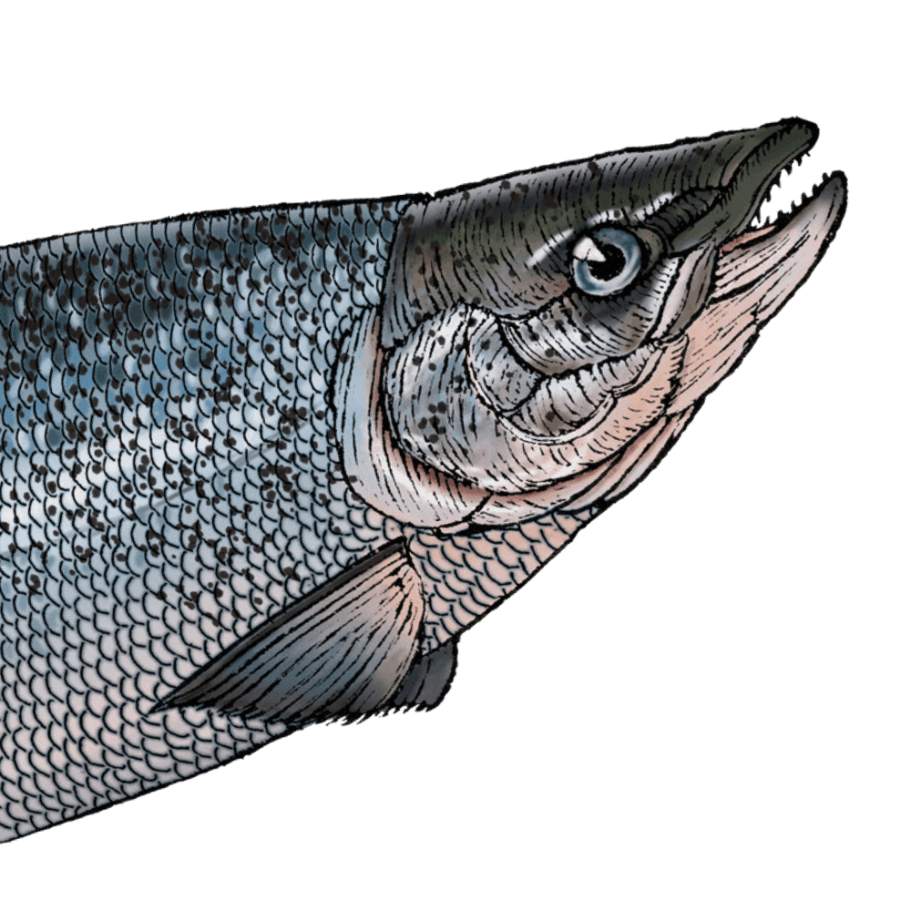
< section> < img src="fish-head.png" alt=""> < div class="info">(…informatii aici…)< /div> < /section> < section> < img src="fish-head.png" alt=""> < div class="info"> < h3>CSS: Ghidul definitiv, ediția a 5-a< /h3> < h4>Aspect web și prezentare< /h4> < p>Sas D.< /p> < p>L.T. Ion Creanga< /p> < /div> < /section> |
|---|---|
| Codul in CSS |
< style type="text/css"> html {background: #CCC;} body {background: #FFF; padding: 1em; width: max-content; display: flex;} section {position: relative; border: 1px solid red; width: 250px; height: 250px;} section:nth-child(1) {margin-right: 100px;} img, div {position: absolute; top: 0; left: 0; max-width: 100%;} div {transform: rotateY(180deg); backface-visibility: hidden; background: rgba(255,255,255,0.9);} section:hover {transform: rotateY(180deg); transform-style: preserve-3d;} div.info {width: 100%; height: 100%; padding: 1em; box-sizing: border-box;} div.info h3 {margin: 1em 0 0;} div.info h4 {margin: 0.25em 0 0;font-style: italic;} < /style> |
| Rezultat |
(…informatii aici…)
CSS: Ghidul definitiv, ediția a 5-aAspect web și prezentareSas D. L.T. Ion Creanga |